Square Online
Square acquired website builder Weebly in 2018.
I joined in 2020.
Remnants of the Weebly identity still remained and brand awareness was poor. Square Online’s identity felt outdated compared to other Square products.
Design systems were lacking and processes were dysfunctional. For example the creative team was solely using bad stock photography and most time was spent cranking out emails that almost no one was opening.
What I worked on:
General Square Online identity improvements + high-level Square brand refresh updates.
Design system + process improvements.
Large-scale go-to-market launches and campaigns.
Advocating for better design + changing limiting antiquated perceptions of our partners.
Primary CMS / web designer on the team. Built, launched, maintained, and generally led the efforts on our 10+ complex web pages.
Primary localization expert + partner for 10+ locales. Implemented better processes.
Art director for photography and illustration.
Interviewed + trained others.
Select Case Study:
Themes
Weebly becomes Square Online and adopts existing website themes. We’ve done a decent job of retaining Weebly users and absorbing Square ecosystem users because our website builder tool is familiar to them, easy to use, and integrated with other Square tools.
However, these themes don’t stand a chance against competitors like Squarespace and Shopify for attracting prospective users. We need to push our themes to not only be more relevant but forward thinking. We plan to roll out impressive new features in the builder tool and want to show these off with new theme designs.
Context:
How can we refresh our themes to satisfy the needs of our existing users while pushing the designs to the next level to attract future users? How can we best display a variety of theme designs that appeal to a wide pool of business types without creating overwhelm? How do we effectively display new features? How do we create beautiful fictitious brands for all of these themes within budget?
Challenges:

Phase 1:
x 20 seller types
x 12 locales
= 240 localized themes

Step one in creating new themes involved creating various type and color combinations called site styles. I explored hundreds of variations. Eventually this process expanded to button styles, icon sets, image frames, banners, and more.

Here’s a simplified example of how each fictitious brand used in a theme came to life. This process started with a seller type such as “Small Unisex Clothing Retailer.” I would select a site style for this vertical then conceptualize a direction for the content, in this case photography.
For this theme I directed and photographed all photos myself.

This is what a theme looks like in the Square Online website builder tool. Each theme has variations of different site styles we felt would pair well with the fictitious brand identity to showcase the variety of design options and ease of use. Our hope is that a seller would select a site example that they identify with, making it easy to simply swap in their images and remix the style to fit their needs.

This is the themes chooser page displaying phase one of the site examples we created. The intent is to show a variety of styles to capture a wider pool of sellers.

For each theme I and one other designer were in charge of creating all content including photography. Once I established the identity of a fictitious brand I also art directed photoshoots. I worked with a production agency and traveled to oversee the multi-day shoots. These shoots were complex and had long shot lists. We had to capture a variety of hero shots, all inventory, and whatever else we needed for other pages on the sites. Some shoots included models. We scheduled at least 2 fictitious brands per shoot so it was vital to schedule everything down to the minute with the high volume. All of this we managed to accomplish within a tight budget.

We also wanted to show prospective users how they could have a beautiful Square Online site without fancy photography, so we worked with an illustrator to create nice fictitious packaging and spot illustrations for sites with little or no photography. I helped direct.

Here’s a high-level example of how we were thinking about our fictitious brands and site examples. For every page of the site ie. Shop All, About Us, Events, Reservations, etc. we’d create realistic assets to help sellers envision how their site could come to life. Sites ranged from all types of standard restaurants and shops to things like medical spa, personal trainer, marketing consultant, interior designer, etc.
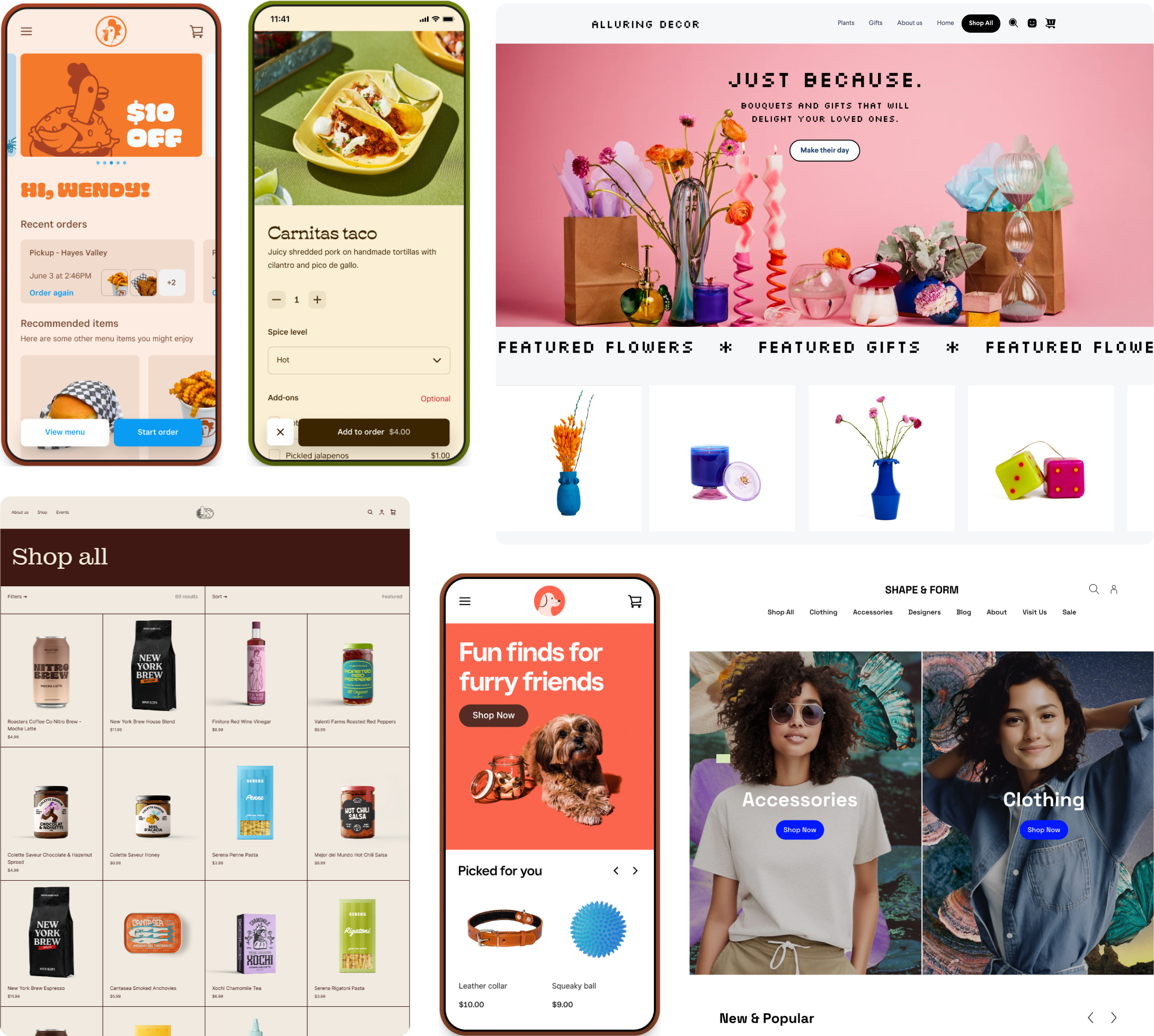
We designed the sites to feel app-like and easy to use on mobile but also have the ability to accommodate x-large retailer’s shop all pages with thousands of items and categories.

This highlights the 4 main web pages showcasing our new themes. I was the designer in charge of managing and building this #1 priority project. I had to manage all of the strong opinions and often times conflicting feedback I received from the numerous stakeholders involved. I also faced challenges with the limitations of the CMS I was working in and had to balance pushing for innovation with realistic timelines and meeting all essential asks. This was the result of phase 1 of themes, so I planned for more innovative updates to roll out in the next phases of launch.
Aside from creating the identities, content, web, email, etc. I also helped direct hype videos and animated snippets to build excitement and showcase the themes. I pulled references, built decks for video direction, outlined motion guidelines, cast models, made styling suggestions, collaborated with the production agencies, etc.